ACM Design Website Redesign
ACM Design is one of the nine committees of ACM (Association for Computing Machinery) at UCLA. ACM Design’s mission is to design, manage, and support the visual identity of ACM. It creates the club’s branding, event banners, and more elements, while also doing workshops to teach UI/UX to the UCLA community.
I worked across the project end to end: leading the homepage redesign from scratch (hero, about us, events and projects), contributing to the design system, helping develop the fox mascot, and designing several of the site’s vector graphics.
The ProblemA Site Without an Identity
Original Website
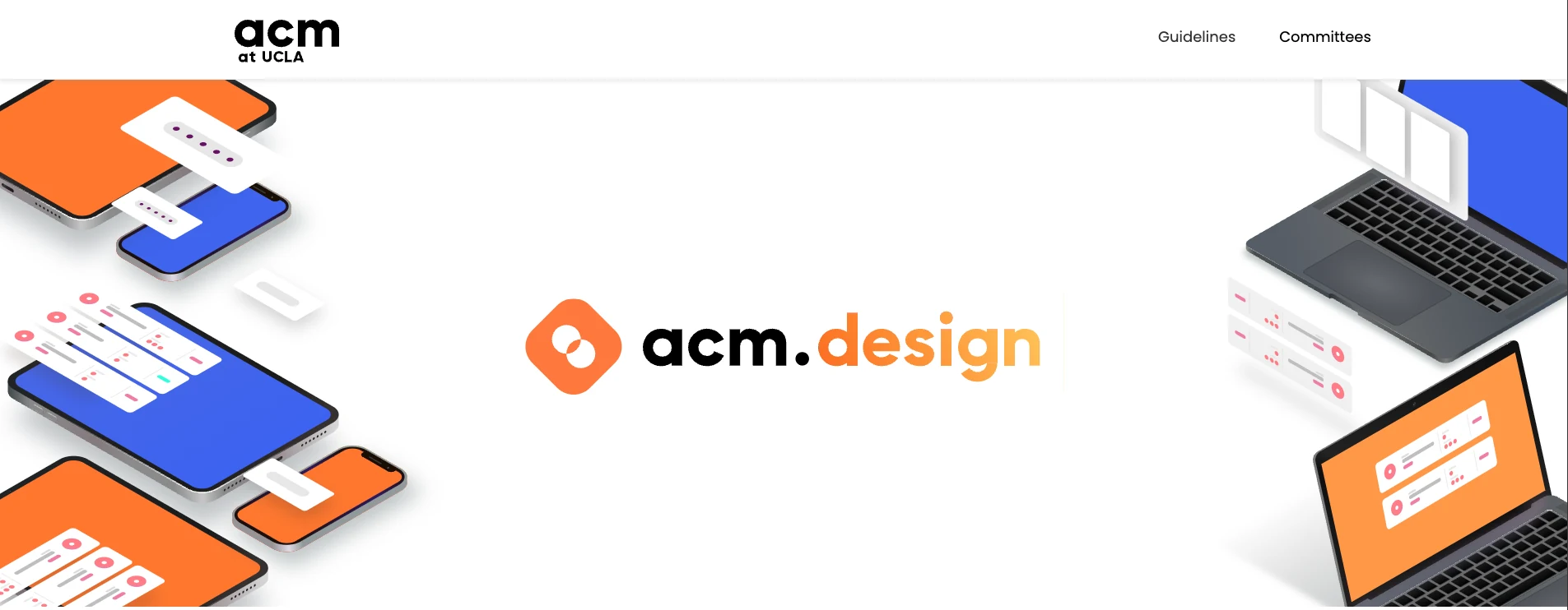
No Visual Identity
The site lacked a distinct visual language, making it impossible to recognize as uniquely ACM Design’s own.
Unclear Club Mission
Visitors couldn’t quickly understand what ACM Design does, the events we run, or how to get involved.
Disconnected Presentation
The overall design felt misaligned with our community’s creative values and the work we actually produce.
The SolutionRebuilt Around a Fox
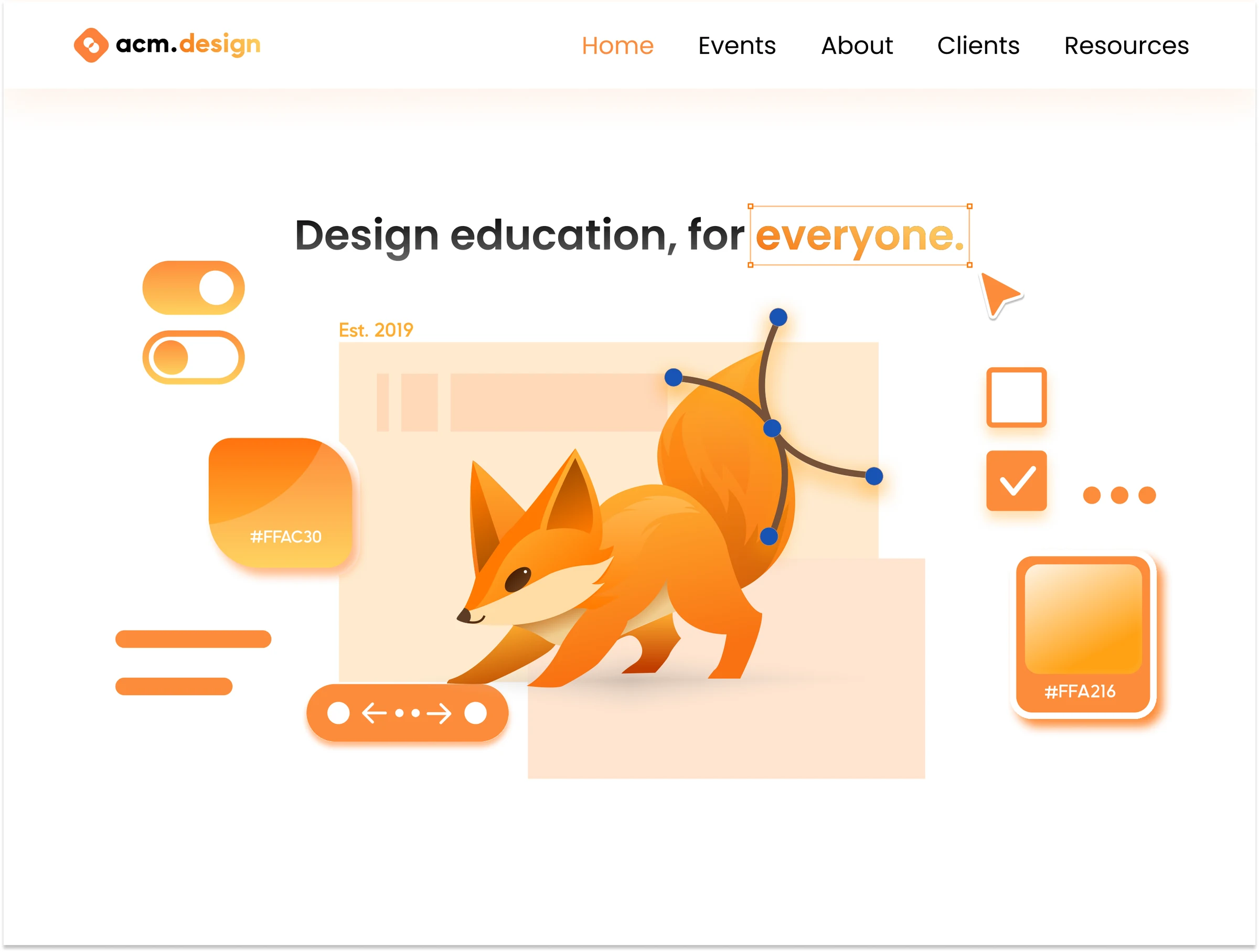
We rebuilt the site from the ground up: a new visual identity anchored by an original mascot, a homepage that leads with what ACM Design actually does, and dedicated events and projects pages so new members have a clear way in.
BrandingThe Only Committee Without a Mascot
Mascot
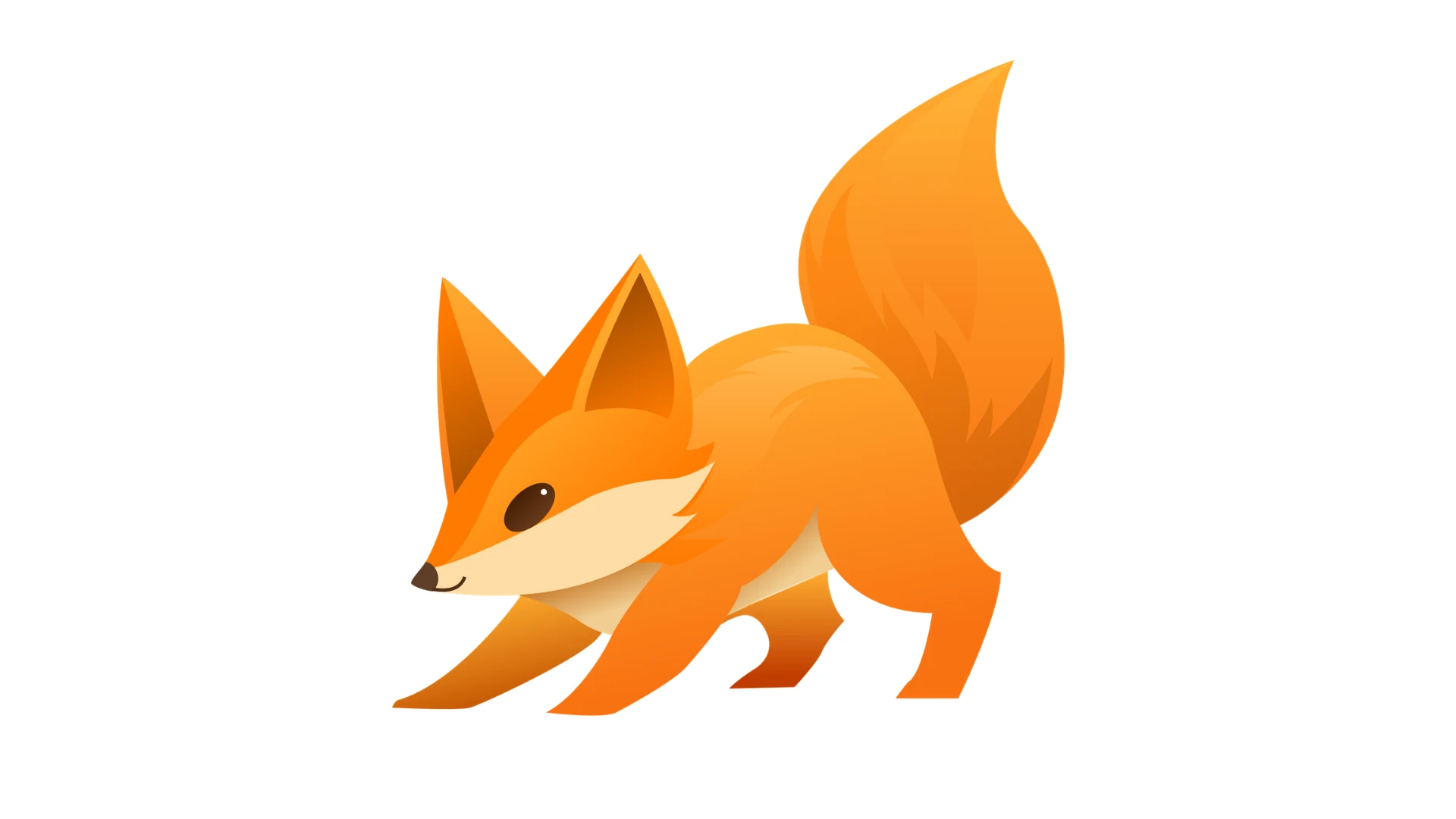
Every ACM committee had a mascot except us. Studio has an axolotl, Hack has a penguin, and we picked a fox: sharp, a little mischievous, and orange enough to match the palette we were already building around.
Design System
We built on top of the existing palette rather than replacing it: the original orange stayed as primary, and we added three secondary tones, a blue accent, and a warm gradient for a cozier, more welcoming feel. Typography stayed shared with the other ACM committees, Westwood Sans and Poppins, so the sites still read as one club.
Colors
Typography
Wordmark Font
Westwood Sans is a proprietary font made by ACM to be used in wordmarks, and wordmarks only.
Header Font
Poppins is the header font for headers in posters and websites. Text using Poppins should not exceed about a dozen words.
WebsiteLeading With What We Do
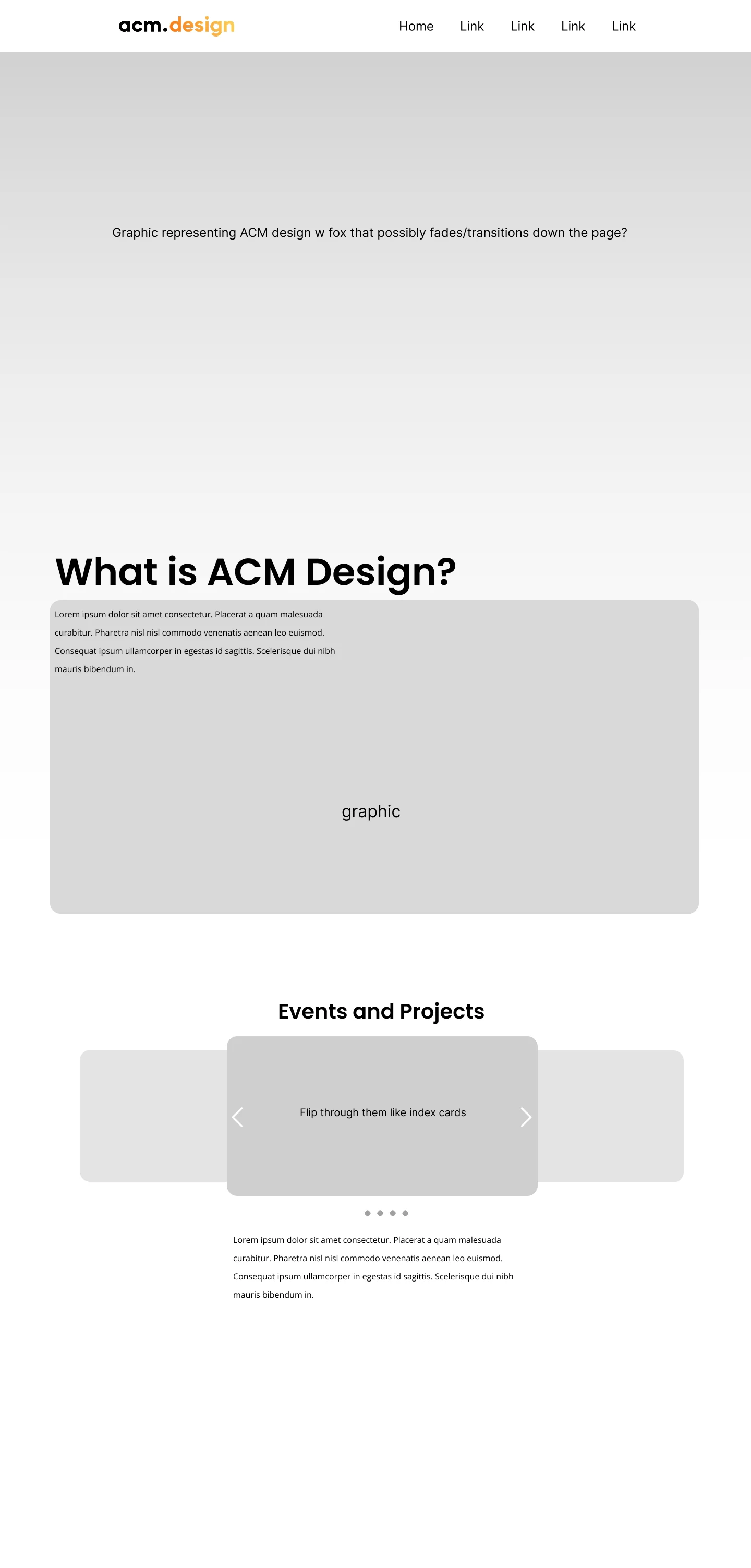
Low-Fidelity Wireframes
I redesigned the homepage from scratch: a hero section built around an original vector graphic and our new fox mascot, an about section that states the club’s mission plainly, and an events and projects page that gives new members a real window into what we do.
Final Homepage
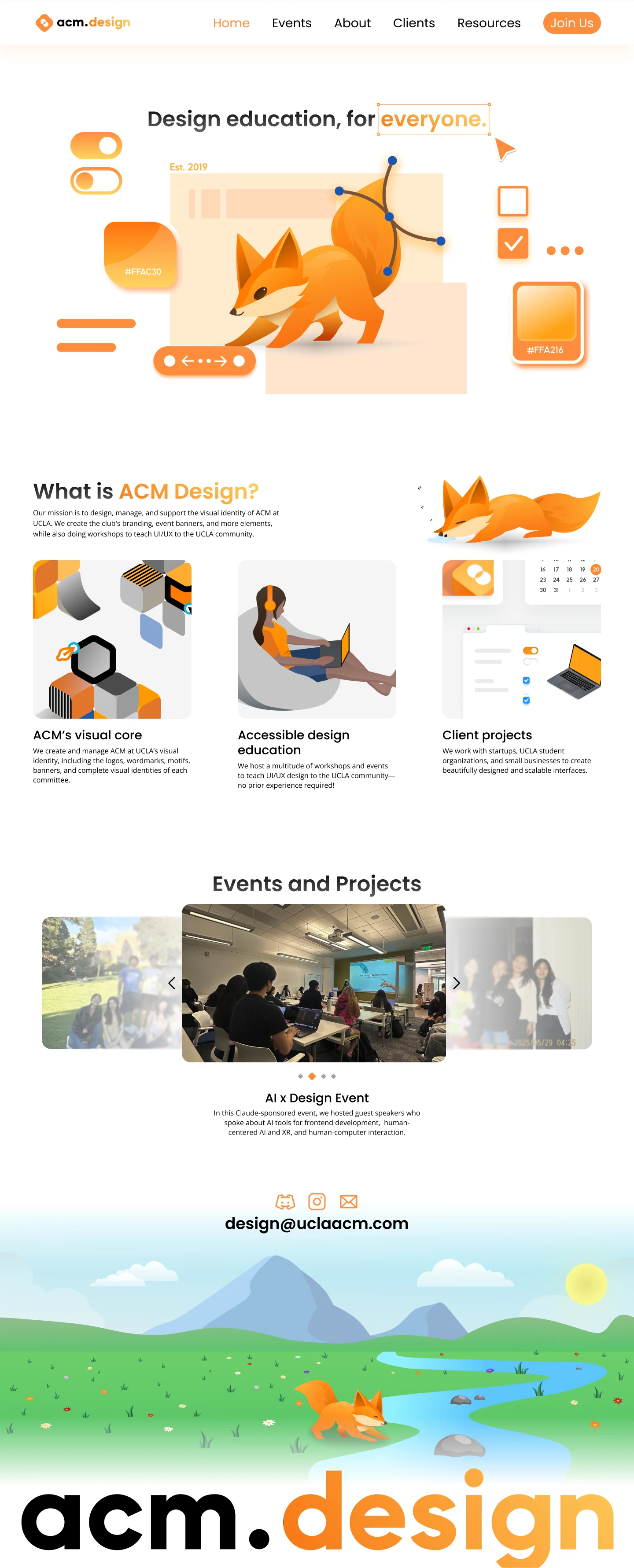
Final Homepage
- The fox keeps the personality without cluttering the layout
- A custom footer illustration gives the page a deliberate close
Illustrations
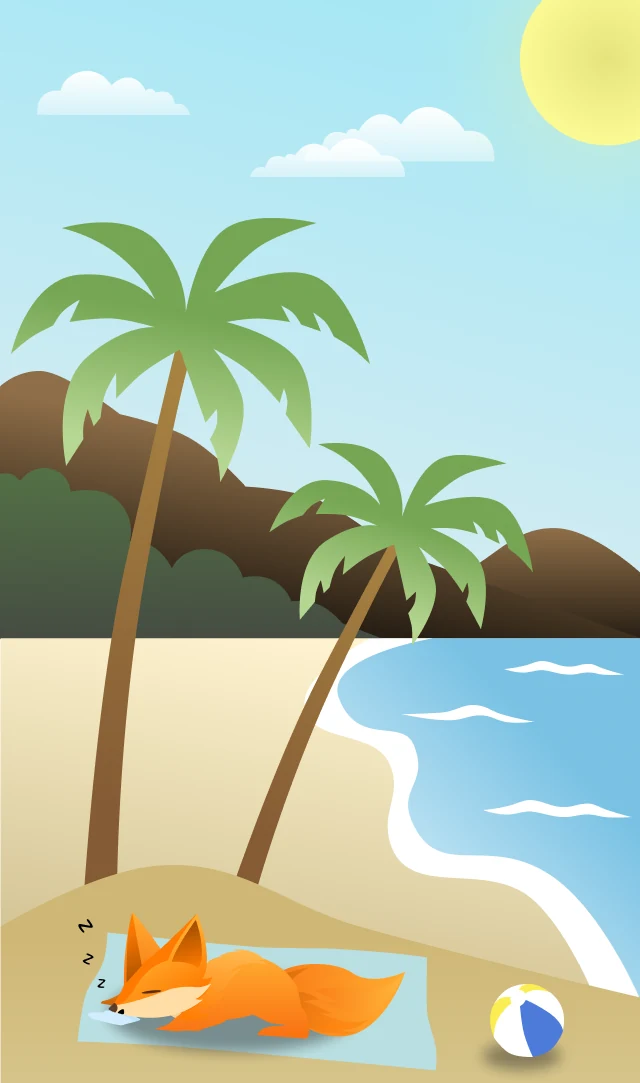
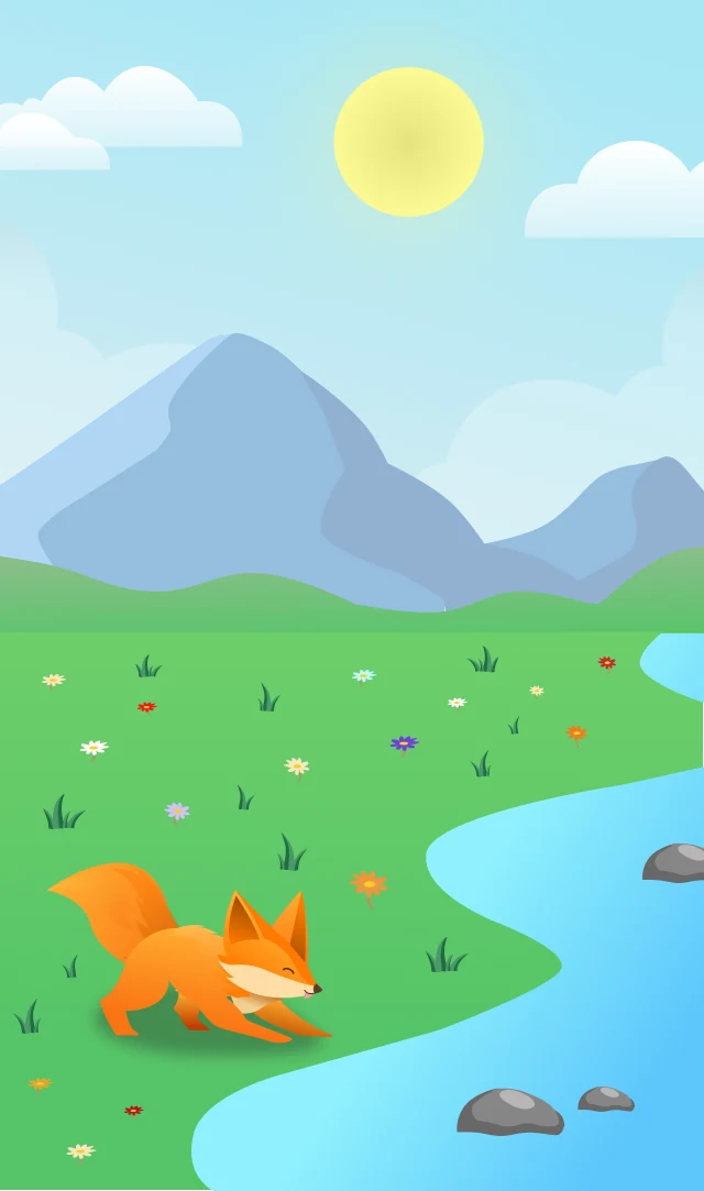
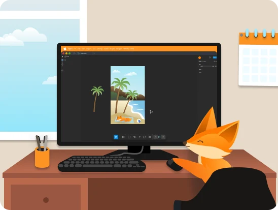
Across the Site
- The mascot and identity show up everywhere the site does
- Hero, footer and event pages
About Page
- The first illustration most visitors see
- Sets the tone for the whole site
TakeawaysIdentity Without Starting Over
Building Identity Without Starting Over
The instinct with a rebrand is to tear everything down. Keeping the original palette and shared typography while adding a new mascot and voice let ACM Design feel distinct without breaking away from the other eight committees it belongs to.
A Mascot Does More Work Than a Logo
One fox, placed consistently across the hero, footer, and event pages, carried more personality than a new logo alone ever could. A single character was easier to scale across the site than a whole new visual system would have been.
Clarity of Purpose Is a Design Problem
The old site’s biggest issue wasn’t how it looked. It was that visitors couldn’t tell what ACM Design actually did. Structuring the homepage around that question mattered more than any individual visual choice.
ConclusionKnowing What to Keep
This project was one I genuinely enjoyed from start to finish. I’m very grateful for my project leads Angelina and Isabelle, along with the rest of the ACM Design team.
What I took away:
- A consistent theme and visual identity shape how people perceive and connect with a brand. Every choice, from color to type to illustration, tells part of that story.
- A strong identity doesn’t always need a blank page. Sometimes it’s knowing which existing pieces are worth keeping, and designing the new ones to work with them.
The website is still in progress, but seeing how it looks so far makes me excited for launch. It’s going to be something ACM Design can truly be proud of!